Color
Maintaining a uniform and consistent look across our District print and digital materials increases brand recognition and creates a unified user experience.
Using our primary brand colors connects your program and message to Round Rock ISD, building recognition and trust with our audiences.
Using Color
Our primary colors should always be the most prominent in marketing materials. Please do not use colors outside our color palette for marketing and promotional purposes or in our campus spaces. Using colors other than those carefully selected to represent our District and schools visually confuses our audiences and fragments our brand identity.
Secondary colors must not be the predominant color. Secondary colors are ideal for elements that require differentiation, such as charts and graphs, iconography, or updates/alerts.
Secondary colors should not become the predominant color.
Avoid color values other than those listed on this page. Do not use tints and shades of these colors. The only exceptions to this rule are Black and grays.
Color combinations for digital text display must meet a contrast ratio of at least 4.5:1 to comply with State and Federal Accessibility regulations.

Round Rock Teal
PMS: 327
CMYK: 100 0 47 15
RGB: 0 149 142
HEX: #00958e

Blue
PMS: 7693
CMYK: 100 72 32 16
RGB: 0 75 116
HEX: #004b74

White
PMS: Process White
CMYK: 0 0 0 0
RGB: 100, 100, 100
HEX: #ffffff
Tips:
- The Round Rock ISD logo should appear on all material.
- Do not apply all colors to a design. Pick Round Rock Teal OR Blue and one OR two secondary colors. Keep it simple.
- White/no color backgrounds are preferred over a color background, especially when the document will be printed or photocopied.
- Either Round Rock Teal or Blue should appear as a primary color on every piece. The use of white, black and gray is encouraged.
- Color contrast tips: Using light colors against a white background (ie. gold, light blue, local limestone, or Round Rock Solid) as a font color is not advised for most applications due to Section 508/ADA color contrast legal violations. Make sure you provide a high contrast between colors and background. Use light font colors against a dark background or dark font colors against a light background. Never place dark color fonts on dark backgrounds or light color fonts on top of light color backgrounds.
- Secondary print colors are to compliment one of the two dominant colors (Round Rock Teal or Blue). They are not to be used as stand alone colors. It is advised to exercise restraint when using the Round Rock ISD color palette. Our branded colors offer several options, but not all colors work well together. Try not to use no more than two secondary colors with a primary color. Less is more. If you have questions, or would like advice on your design, contact our experts in Marketing Services.
Secondary Print Colors
Our secondary palette is designed to work in harmony with the primary color palette. Use sparingly. These colors are only to be used as background, graphic or typographic highlights on printed/digital graphics.
Under no circumstances should secondary colors become the predominant color in a design.

Gold
PMS: 465
CMYK: 22 31 63 0
RGB: 203 171 115
HEX: #cbab73

Deep Blue
PMS: 303
CMYK: 100 47 22 82
RGB: 0 29 52
HEX: #001d34

Energize Orange
PMS: 166
CMYK: 0 77 97 0
RGB: 242 97 38
HEX: #f26126

Calm Blue
PMS: 304
CMYK: 25 0 4 0
RGB: 187 229 240
HEX: #a2dceb

Local Limestone
PMS: 7528
CMYK: 0 3 10 10
RGB: 231 222 208
HEX: #e7ded0

ADA Accessible Teal
PMS: xxxx
CMYK: 91 47 46 19
RGB: 0 100 112
HEX: #006470

(Round) Rock
PMS: 7534
CMYK: 16 13 17 0
RGB: 213 210 203
HEX: #d5d2cb

Gray
PMS: xxx
CMYK: 64 56 53 28
RGB: 88 89 91
HEX: #56565a

Black
PMS: Process Black
CMYK: 0 0 0 100
RGB: 0 0 0
HEX: #000000
Examples of correct use of print colors

White text on Round Rock Teal.

Round Rock Teal text with secondary colors Local Limestone and Calm Blue.

Blue and ADA Accessible Teal text on Local Limestone background.

Bold colors on Local Limestone background.

Bold colors on light background.

Deep Blue text on Calm Blue background.

Gold is best used as an accent color with blue or teal. Refrain from using Gold as a font color or font background color as it does not provide sufficient contrast.
In most cases, Round Rock ISD Teal and Gold do not meet Section 508 ADA minimum legal requirements for contrast on websites. Therefore, their use on websites is to be avoided. ADA Accessible Teal is our theme’s default web color. Blue and Deep Blue are other options. See examples below for correct usage.

ADA Accessible Teal
Default theme color
HEX: #006470

Blue
HEX: #004b74

Deep Blue
HEX: #001d34
Tips:
- ADA Accessible Teal replaces Round Rock Teal as the theme’s default color for webpages to meet Section 508 ADA contrast requirements.
- Either ADA Accessible Teal, Blue or Deep Blue should be the dominant color on every page.
- Secondary colors are listed below. They were chosen to meet strict Section 508 legal requirements. Do not alter or add unapproved colors to pages.
- Do not use Round Rock Teal or Gold on websites as the colors do not provide sufficient color contrast when used as a font or background color.
- Do not use red or any other unauthorized color to convey importance or a user action as a font color. This practice can be a violation of Section 508 ADA laws. The approved red should only be used to convey health emergencies or for use with Anonymous Alerts, crisis or for other outside campaigns.
- By default, heading and paragraph text color is rendered via our theme. Do not alter font colors or fonts on the website.
- Use white text on top of ADA Accessible Teal, Blue or Deep Blue to provide a high contrast result.
- It is not advised to use light colors on websites and other digital material unless an accessibility checker determines a sufficient high contrast ratio.
Secondary website/email Colors
Our secondary palette is designed to work in harmony with the primary color palette. These colors are only to be used as background colors. Never use secondary colors for text as it does not adhere to ADA legal requirements.
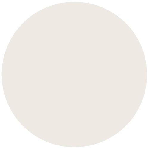
Tan
HEX: #eee9e3

Light Gray
HEX: #f1f1f1

Medium Gray
HEX: #d6d6d6

Dark Gray
HEX: #56565a
Use white text only.

Light Calm Blue
HEX: #ebf5f9

Call to Action (CTA) Button Yellow
HEX: #f0c146
Call to Action Yellow is only to be used as a button’s background color.

Emergency/Crisis Button Red
HEX: #ff4d54
Emergency/Crisis Red is only to be used only as a button’s background color for a health crisis or emergency alert purposes, ie. Child abuse hotline, suicide prevention hotline, closures. Do not use this color for text or to draw attention to an announcement.
Examples of correct use of web colors


CTA Yellow is only to be used as a button background color. Never use it as a text color or a background color for a text box. Make sure the associated button font is semi bold or bold. This is a statement color, so limit its use on pages.

Use of Deep Blue, semi bold Bitter font on Tan background meets legal contrast requirements.
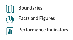
ADA Accessible Teal color icons meet legal contrast requirements.
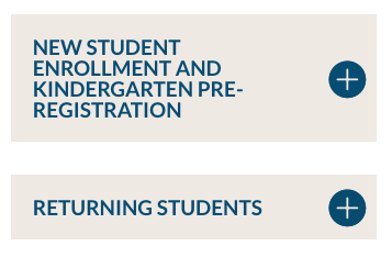
Semi bold default font in Blue over Tan background.

Use of Light Gray background with secondary font using theme’s default color.

Light Gray background with default heading and body text with ADA Accessible Teal button.
Incorrect Usage
Pay special attention to use of color as it relates to Section 508 ADA laws. Placing the color Gold or Round Rock Teal on white does not meet the minimum state and federal legal requirements for ADA contrast ratios on websites. Make sure all color usage meets federal and state legal requirements as required by Section 508.
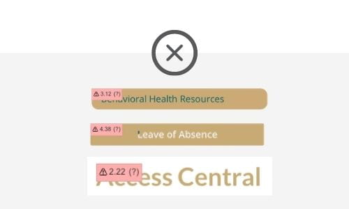
Do not use Gold on websites as it does not meet ADA legal requirements for low contrast. Gold is not an approved website color for this reason.

Refrain from using the Round Rock Teal as a background or font color as it does not meet ADA legal requirements for low contrast. Instead, use ADA Accessible Teal.
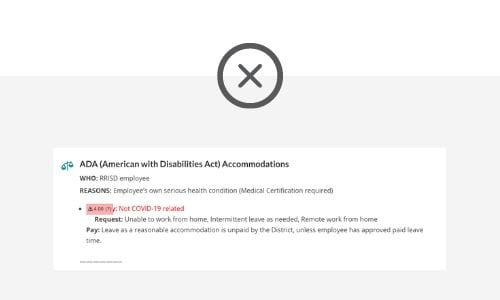
Do not use unapproved web colors. Do not use color to convey importance – this is a violation of ADA laws.
